In LG Signs the first thing you need to do is choose a size and add text into your design. This knowledge base article provides a simple guide on how to do this. To design a sign or showroom plate, just make your way through each tab. Set up and style each element before you save it as a template or print it out.
The Builder Tabs – Text
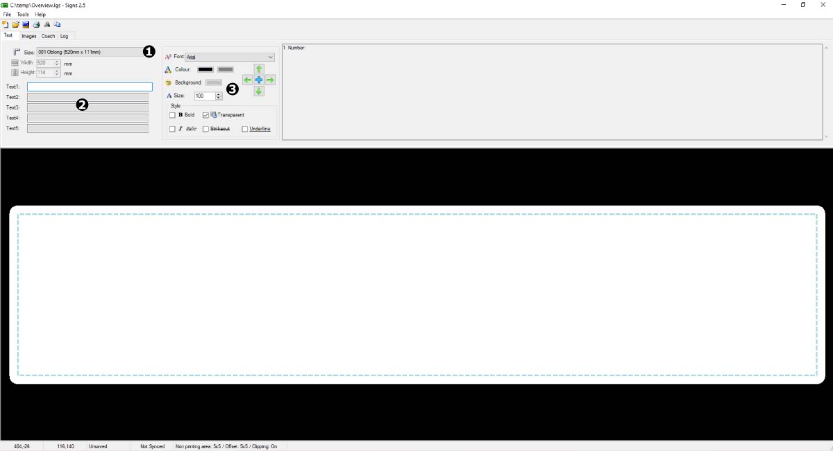
Text options are on the first tab
Start up LG Signs and wait until it has loaded up onto your desktop. Select the Text tab on the builder, as shown in the image below, if it’s not already active. Now you’re ready to start building a new sign.
As can be seen on the image above, the Text options and controls are split into 3 sections. Here you can select a size for your design and add different text elements into it. And you can position and style each text field independently.
- 1: Select a Sign Size
- 2: Add 5 Text Fields
- 3: Style & Position Each Text Field
Pick A Size
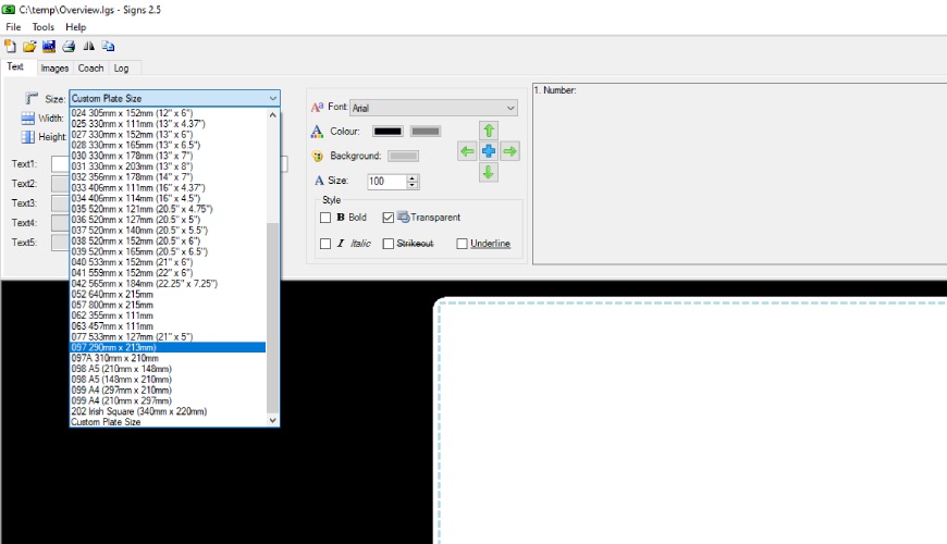
Pick a pre-populated or custom size
First thing you need when starting a design is to pick a size for your sign. This depends on the type of sign your are making or which components you have to print on.
Begin by clicking the drop down next to the Size icon, the right angle ruler. The drop down is pre-populated with our plate component sizes. Simply cycle down the list until you see the size you’re after, and then click to select it. The preview window below will automatically change its appearance to represent the new size.
Add Text
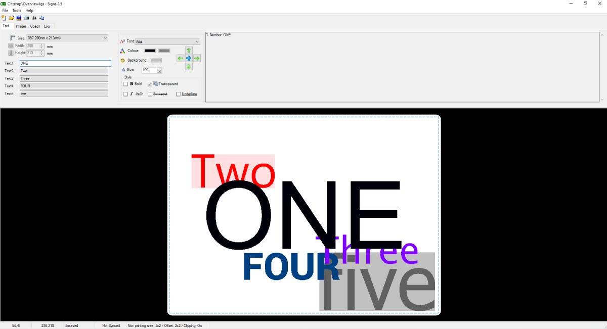
Type text into the 5 fields or layers
Once you selected your signs size, you can begin to add and style elements into it. The LG Signs Text tab allows you to enter 5 separate text elements into your design. Which is enough for a simple sign or all the elements on an Irish number plate.
To add text simply click into one of the fields and type your content. If you need to insert a line break use underscore_ to make your text start a new line. Once you have added your text, you need to style and get it into position. As can be seen on the image above, each one can have a different size, font typeface, colour and background.
Content Layers
In addition to adding content, the text fields let you organise their layering as well. By layering, we mean which text appears above or below another. The layering order the fields use is simply 1 to 5, which is clearly shown on the picture above. So whatever content you put in Text 1 is rendered above all the other text fields.
Style Your Text
Each field can be styled separately
In the middle of the Text controls you will find the options to place and style your text. And it should be familiar to everyone who has used standard Windows apps.
Pick a font, colour and background
Pick a Typeface
To start styling, click into your target text field to activate it. Then pick a typeface from the dropdown, which shows all the fonts found on your computer. Just choose the one you want and click it to apply it to your content. At the bottom you’ll find the options to select other font effects like bold and italic. Meanwhile the preview window will update to reflect your changes.
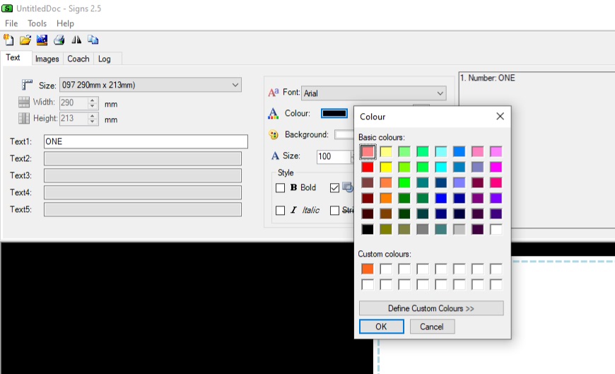
Set a Font Colour
Underneath the font dropdown are the controls to set the stroke and background colour of your text. By default all text starts with a black stroke and a white background. Among the style options is a transparency check box, which will remove the background colour.
Begin by clicking the coloured box, this will reveal the basic palette tool. Here you can either select one of the existing colours or define your own custom colour. One you’re happy with your selection, press the OK button to apply it to the font. Repeat these steps if you want to define a background fill to your font.
Resize and Position
Sooner or later you will want to resize and position the text on your design. While the font size is easy to alter, simply use the dropdown and pick another size. Positioning blocks of text accurately will take you a little bit more practice.
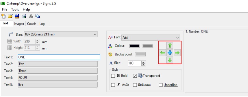
Place each text layer into your design
Note: In LG Signs the Font Size is in points (pt) & 1 point is equal to 1/72 of an inch or 0.35mm.
We suggest you select a text field to activate it, and then click within the preview window. The centre of your text will move to that position, helping you set the general area first. Now you can use the nudging controls highlighted on the image above to fine tune its position.
Upon clicking the blue cross, your element will move to the absolute centre of your sign. Whereas clicking the outer green arrow will move it in the indicated direction. To save you clicking an arrow multiple times, click it once and then just repeatedly press enter on your keyboard.
After adding your text you can move on to other elements of your sign. In the next article we cover how to add a background or other images.